Bebe Mae Jewellery


Brand Strategy
Messaging
Visual Identity
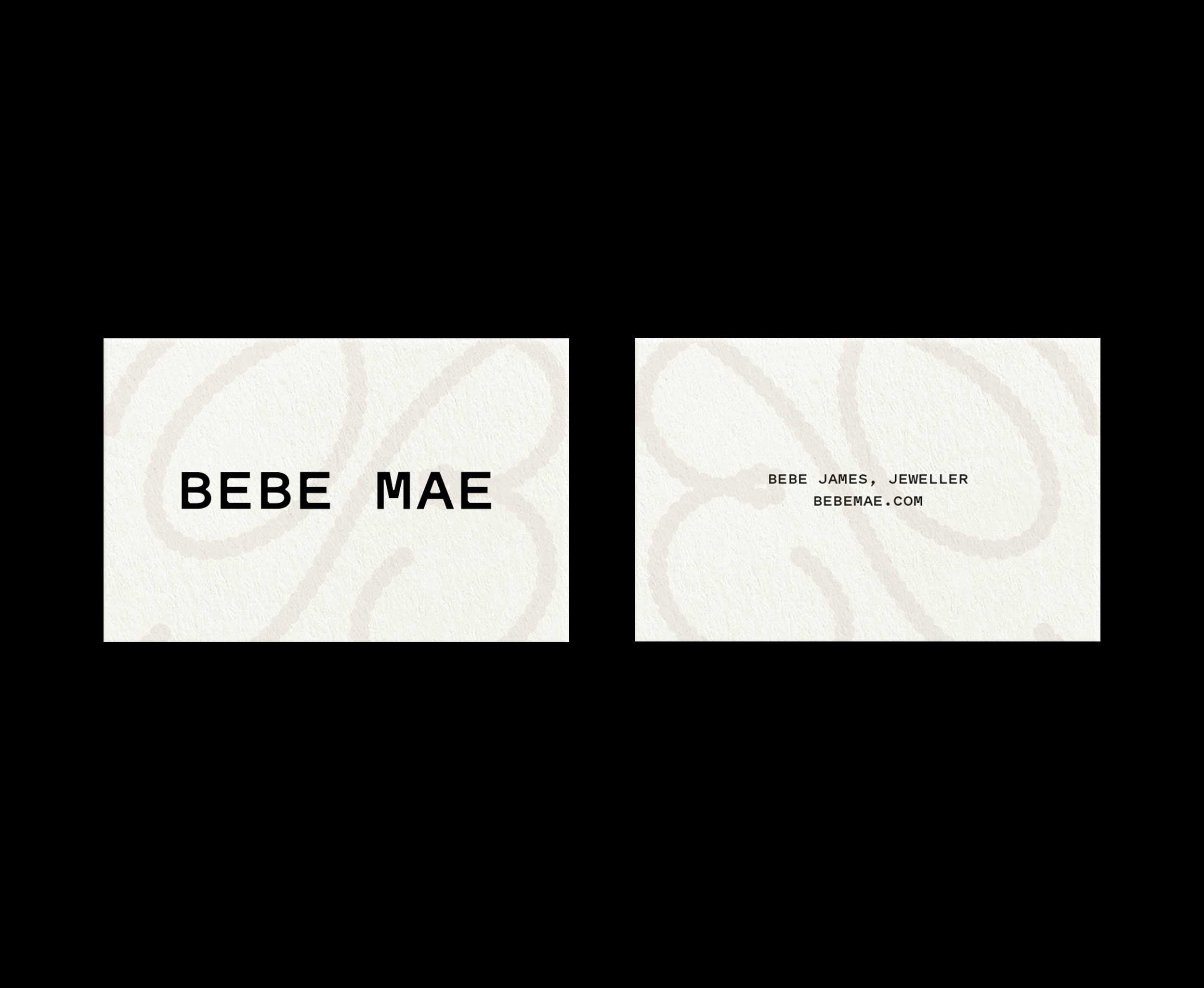
Printed Materials
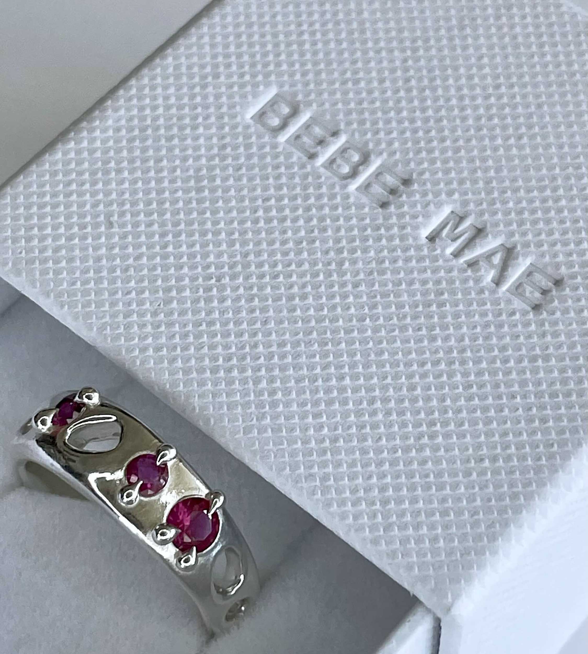
Packaging
Bebe Mae is a Dunedin jeweller who walks a line between playfulness and refinement. After building their business and stocking their work at several well-known boutiques, they wanted to build a recognisable brand and increase sales on their own website. Their new identity is shaped around their genuine character, customer needs, and edge in the market.
The ‘B’ logo is based on English calligraphy from the 17th and 18th centuries – a time when many iconic jewellery styles also originated. Just as Bebe Mae experiments with traditional motifs, their logo puts a new spin on the calligraphic ‘B’. Against a soft colour palette, their visual identity is a sophisticated backdrop for eccentric work.
“Emily has so much personable charm and unwavering professionalism. I really enjoyed collaborating with someone who focuses on creative subtleties. Our collaboration resulted in something elegant and timeless, allowing my work to evolve and advance without limitations.” – Bebe James, Owner